Building a Custom Date Picker for the Web Without a Framework
By - Sabina Gurung
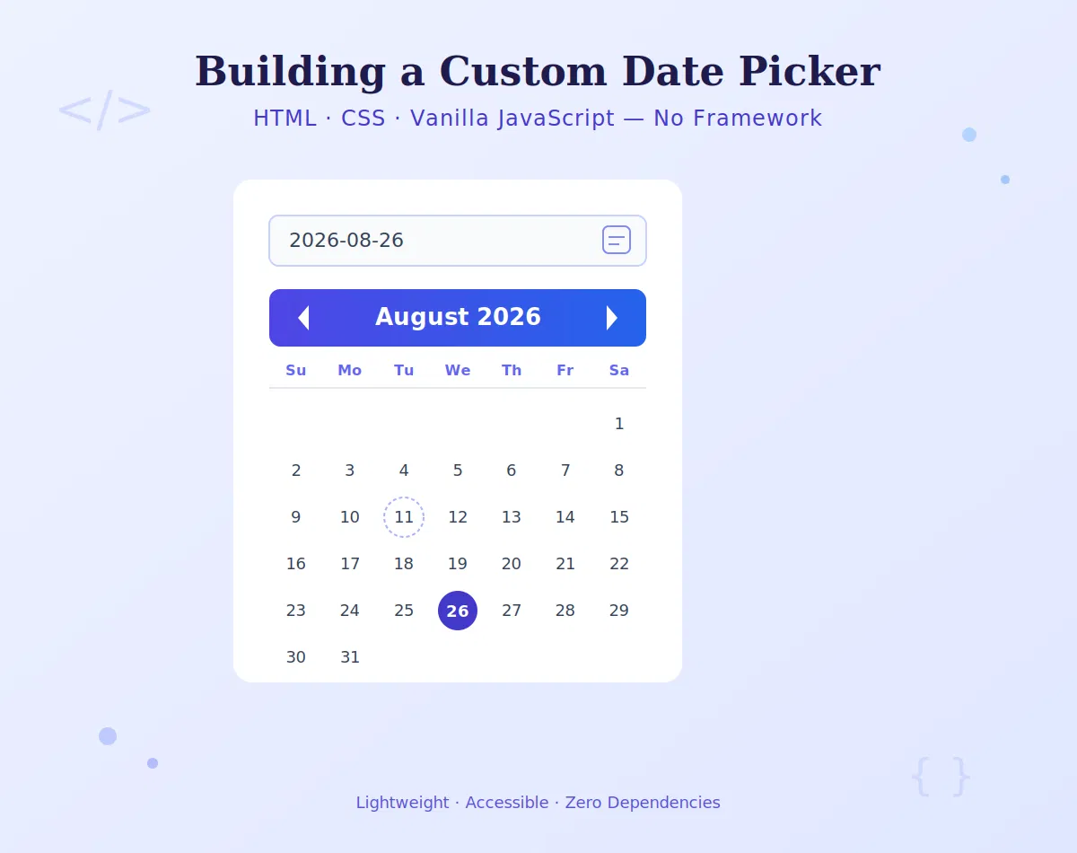
Building a Custom Date Picker for the Web Without a Framework
Date pickers feel like a solved problem - until you actually need one. Drop a popular library into your project and suddenly you've pulled in a dependency tree, a CSS file fighting your design system, and JavaScript that runs whether or not the calendar is even open.
Most date picker libraries drag in far more markup and JavaScript than a typical project needs. We wanted something small, accessible, and easy to theme with plain CSS variables - so we built our own from scratch, starting with keyboard navigation before touching a single style. The result is a component that ships in a few kilobytes, works without a build step, and respects the user's locale by default.
This post walks through how we built it: the structure, the accessibility model, the keyboard interactions, and the theming layer - in that order, because that's the order that actually matters.
Why start with keyboard navigation?
It's tempting to start with the visuals: draw a grid, style the cells, add a popup. But a date picker is fundamentally an interaction pattern, not a layout. If you design the interaction first, the markup and styling fall into place naturally. If you design the visuals first, you end up retrofitting keyboard support onto a structure that wasn't built for it - which is how most inaccessible date pickers get made.
So we started with a question: what should happen when a keyboard-only user tabs into this component? The answer comes from the WAI-ARIA Date Picker pattern, which we used as a foundation rather than reinventing:
Tab moves focus into the calendar grid and back out - not cell by cell.
Arrow keys move focus between days, without changing anything until a selection is confirmed.
Enter / Space selects the focused day.
Escape closes the picker without a selection.
Page Up / Page Down jump a month; with Shift, a year.
Home / End jump to the start/end of the week.
Only one day is ever in the tab order at a time (roving tabindex), so pressing Tab doesn't force a user through 30+ stops to get past the calendar.
The markup
The whole thing is an <input> paired with a role="dialog" popup containing a role="grid":
html
<div class="datepicker">
<label for="dp-input">Date</label>
<input
id="dp-input"
type="text"
autocomplete="off"
aria-haspopup="dialog"
aria-expanded="false"
/>
<div class="dp-popup" role="dialog" aria-modal="true" aria-label="Choose date" hidden>
<div class="dp-header">
<button type="button" class="dp-prev" aria-label="Previous month">‹</button>
<div class="dp-month-year" aria-live="polite">March 2026</div>
<button type="button" class="dp-next" aria-label="Next month">›</button>
</div>
<table class="dp-grid" role="grid" aria-labelledby="dp-month-year">
<thead>
<tr>
<!-- localized weekday abbreviations, generated in JS -->
</tr>
</thead>
<tbody>
<!-- 6 rows of 7 <td role="gridcell"> cells, generated in JS -->
</tbody>
</table>
</div>
</div>
Nothing exotic - a table for the grid (rows and columns are literally what a calendar is), buttons for navigation, and aria-live="polite" on the month/year label so screen reader users hear the month change without it being announced twice.
Generating the grid and respecting locale
This is the part most homegrown date pickers get wrong: they hardcode "Sunday" as the first day of the week and English month names. The Intl APIs make this unnecessary.
javascript
function getWeekdayLabels(locale) {
const formatter = new Intl.DateTimeFormat(locale, { weekday: 'short' });
// Jan 4, 2026 is a Sunday — a stable, known anchor date
const days = [];
for (let i = 0; i < 7; i++) {
days.push(formatter.format(new Date(2026, 0, 4 + i)));
}
return days;
}
function getFirstDayOfWeek(locale) {
// Intl.Locale exposes this in modern browsers; fall back to Sunday
try {
return new Intl.Locale(locale).weekInfo?.firstDay % 7 ?? 0;
} catch {
return 0;
}
}
function buildMonthGrid(year, month, locale) {
const firstDay = getFirstDayOfWeek(locale);
const firstOfMonth = new Date(year, month, 1);
const startOffset = (firstOfMonth.getDay() - firstDay + 7) % 7;
const gridStart = new Date(year, month, 1 - startOffset);
const cells = [];
for (let i = 0; i < 42; i++) {
const date = new Date(gridStart);
date.setDate(gridStart.getDate() + i);
cells.push({
date,
inMonth: date.getMonth() === month,
isToday: isSameDay(date, new Date()),
});
}
return cells;
}
function isSameDay(a, b) {
return a.getFullYear() === b.getFullYear()
&& a.getMonth() === b.getMonth()
&& a.getDate() === b.getDate();
}
Because Intl.DateTimeFormat and Intl.Locale are built into every modern browser, the picker automatically shows "lun." instead of "Mon" for a French locale, and starts the week on Monday instead of Sunday - with zero translation files shipped.
Wiring up the roving tabindex
The core accessibility trick is that every cell has tabindex="-1" except the currently active one, which has tabindex="0". Arrow keys move that active cell rather than triggering the browser's default tab order.
javascript
function handleGridKeydown(event, grid, state) {
const deltas = {
ArrowRight: 1,
ArrowLeft: -1,
ArrowDown: 7,
ArrowUp: -7,
Home: -state.activeDate.getDay(),
End: 6 - state.activeDate.getDay(),
};
if (event.key in deltas) {
event.preventDefault();
moveActiveDate(state, deltas[event.key]);
focusActiveCell(grid, state);
return;
}
if (event.key === 'PageUp') {
event.preventDefault();
shiftMonth(state, event.shiftKey ? -12 : -1);
focusActiveCell(grid, state);
}
if (event.key === 'PageDown') {
event.preventDefault();
shiftMonth(state, event.shiftKey ? 12 : 1);
focusActiveCell(grid, state);
}
if (event.key === 'Enter' || event.key === ' ') {
event.preventDefault();
selectDate(state.activeDate);
}
if (event.key === 'Escape') {
closePopup();
}
}
function focusActiveCell(grid, state) {
const prev = grid.querySelector('[tabindex="0"]');
if (prev) prev.tabIndex = -1;
const next = grid.querySelector(
[data-date="${formatISO(state.activeDate)}"]
);
if (next) {
next.tabIndex = 0;
next.focus();
}
}
That's the entire interaction model. No dependency, no virtual DOM diffing - just moving a data pointer and re-rendering the tiny bit of DOM that changed.
Theming with CSS custom properties
Since the component ships unstyled by default, every visual decision is exposed as a CSS variable rather than baked in:
css
.datepicker {
--dp-bg: #ffffff;
--dp-border: #d0d5dd;
--dp-radius: 8px;
--dp-accent: #2563eb;
--dp-text: #1f2937;
--dp-muted: #9ca3af;
--dp-hover: #eff6ff;
--dp-today-ring: var(--dp-accent);
--dp-font: inherit;
}
.dp-popup {
background: var(--dp-bg);
border: 1px solid var(--dp-border);
border-radius: var(--dp-radius);
font-family: var(--dp-font);
color: var(--dp-text);
box-shadow: 0 8px 24px rgba(0, 0, 0, 0.08);
}
.dp-grid td[role="gridcell"] {
cursor: pointer;
border-radius: 6px;
}
.dp-grid td[role="gridcell"]:hover {
background: var(--dp-hover);
}
.dp-grid td[aria-selected="true"] {
background: var(--dp-accent);
color: white;
}
.dp-grid td[data-today="true"] {
box-shadow: inset 0 0 0 1px var(--dp-today-ring);
}
.dp-grid td:not([data-in-month="true"]) {
color: var(--dp-muted);
}
A consumer can restyle the entire thing for a dark theme by overriding a handful of variables at the wrapper level - no CSS specificity fights, no build step to recompile Sass variables:
css
.datepicker.dark {
--dp-bg: #1f2937;
--dp-border: #374151;
--dp-text: #f3f4f6;
--dp-hover: #374151;
--dp-accent: #3b82f6;
}
Putting it together
The public API stays deliberately small - one function to mount it, one event to listen for:
javascript
function createDatePicker(input, options = {}) {
const locale = options.locale || navigator.language;
const state = {
activeDate: new Date(),
selected: null,
};
// ...build popup, attach listeners, render grid...
input.addEventListener('focus', () => openPopup(state, locale));
const popup = input.nextElementSibling;
popup.addEventListener('keydown', (e) => handleGridKeydown(e, popup, state));
return {
getValue: () => state.selected,
setValue: (date) => { state.selected = date; renderGrid(state, locale); },
destroy: () => { /* remove listeners, popup */ },
};
}
// usage
const picker = createDatePicker(document.getElementById('dp-input'));
document.getElementById('dp-input').addEventListener('change', () => {
console.log(picker.getValue());
});
No framework runtime, no virtual DOM, no CSS-in-JS. Just a plain script tag or ES module import.
What this approach gets you
Size - the whole thing, HTML template plus JS plus CSS, comes in well under 10KB minified, versus 30–80KB+ for many popular date picker libraries.
Accessibility by construction - because keyboard support was the starting point rather than an afterthought, there's no gap between "looks right" and "works with a screen reader."
Locale correctness for free -
Intlhandles month names, weekday order, and formatting without a translations bundle.Zero build step - it's plain HTML/CSS/JS, so it drops into any stack, framework or not.
Trivial theming - CSS custom properties mean design changes don't require touching JavaScript or recompiling anything.
Trade-offs worth naming
Building your own isn't free. You give up the edge-case handling that mature libraries have accumulated over years - things like range selection across time zones, RTL layout quirks, or exotic calendar systems (Hijri, Buddhist, etc.) all need to be added deliberately if you need them. For a simple, accessible, single-date picker used across a handful of forms, that trade-off is easy to make. For a product that needs every calendar edge case covered out of the box, an established library may still be the better call.
The core lesson holds either way: designing the keyboard interaction first - before a single pixel is styled - is what makes an accessible component accessible, not a checklist applied at the end.